Pieces
Why I use BottleTops
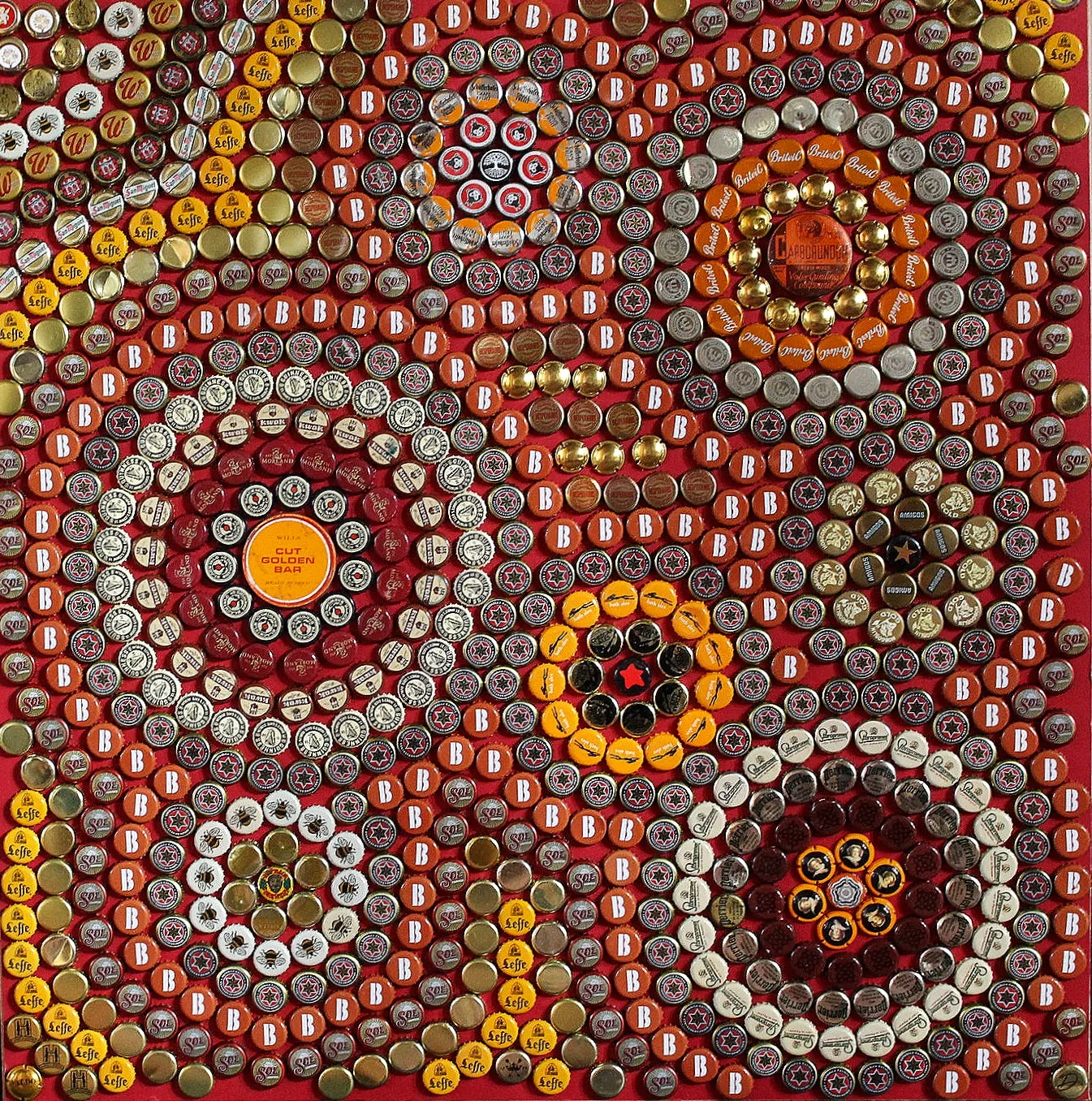
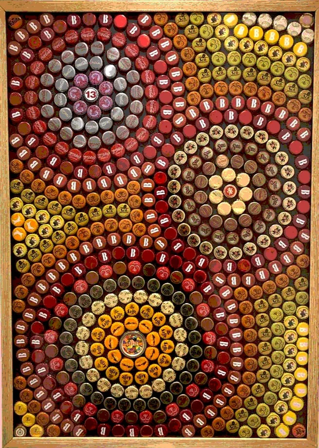
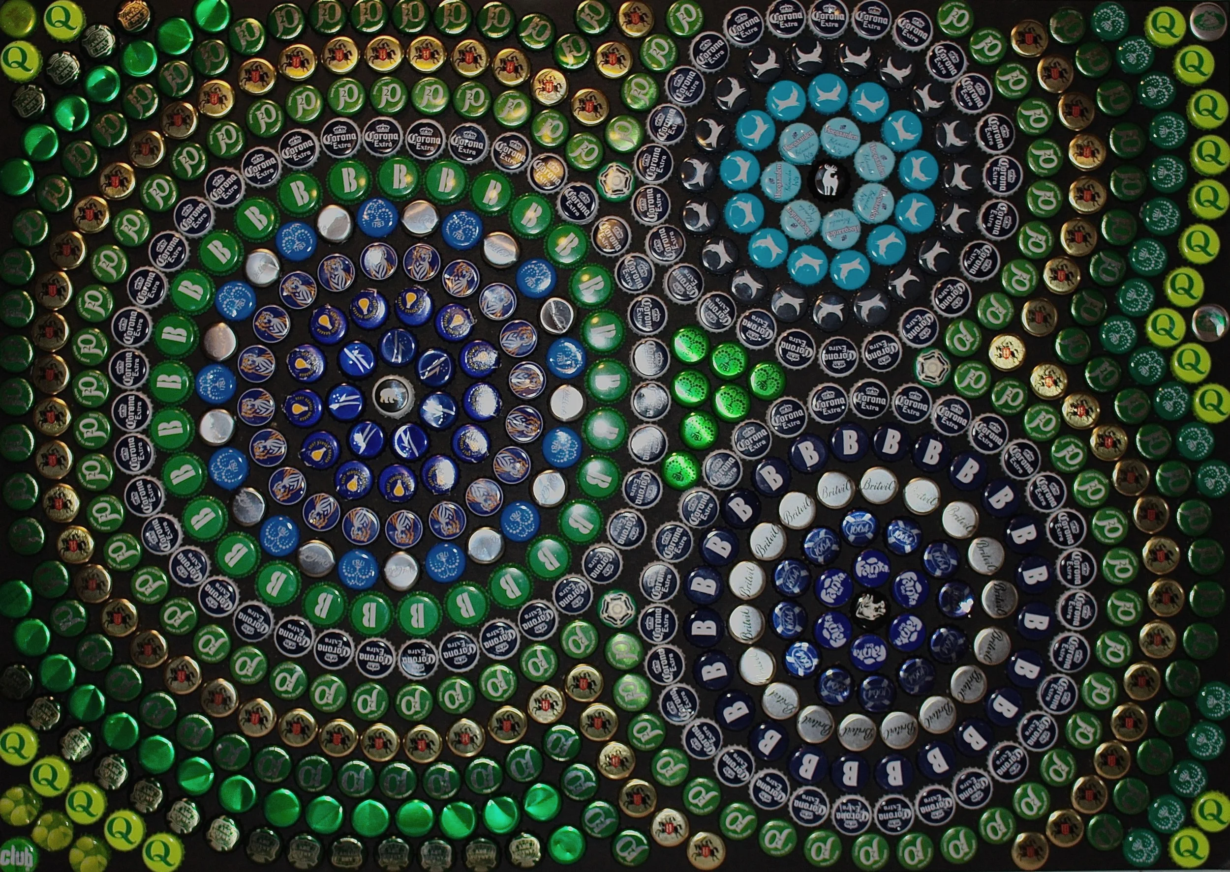
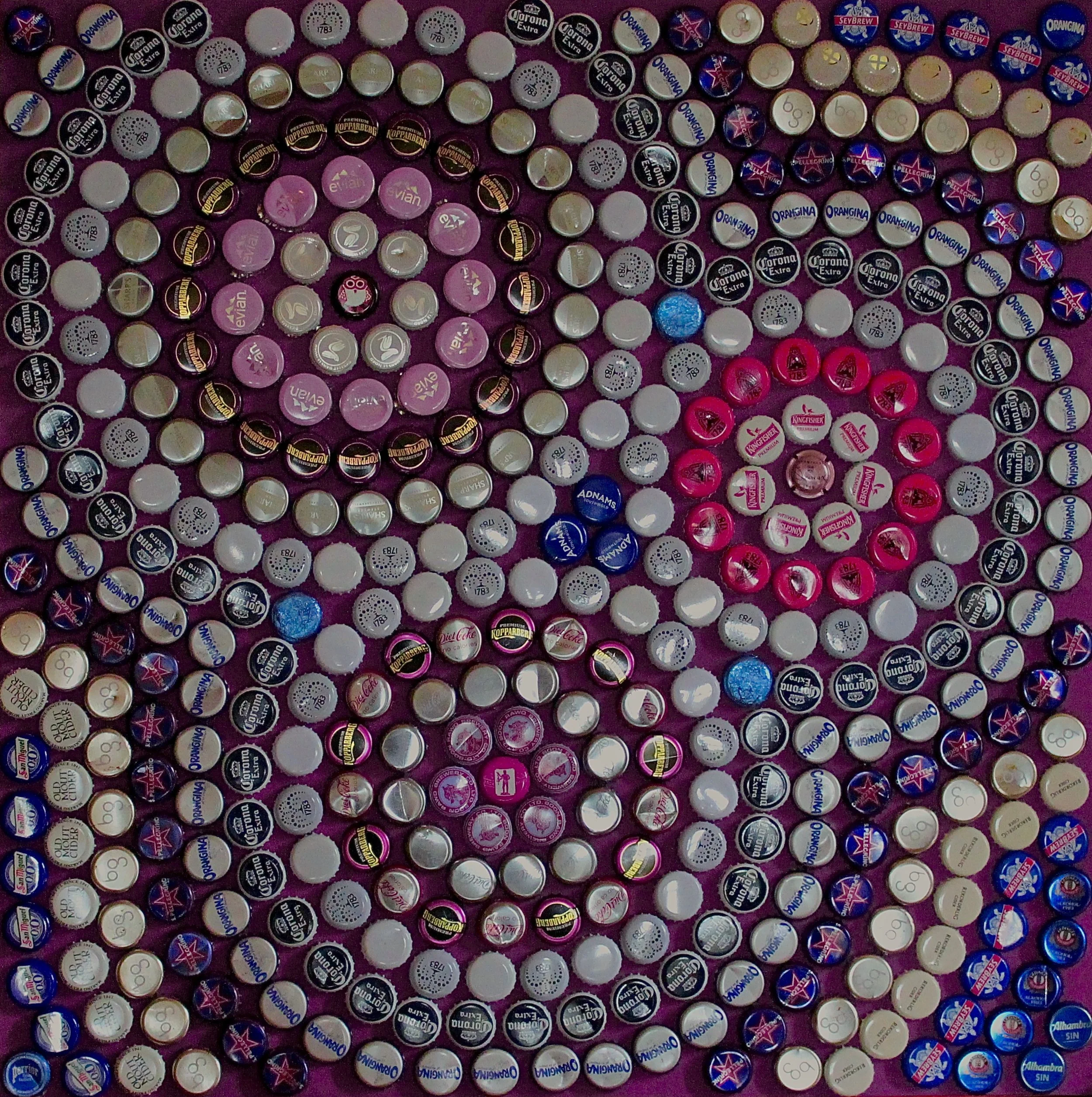
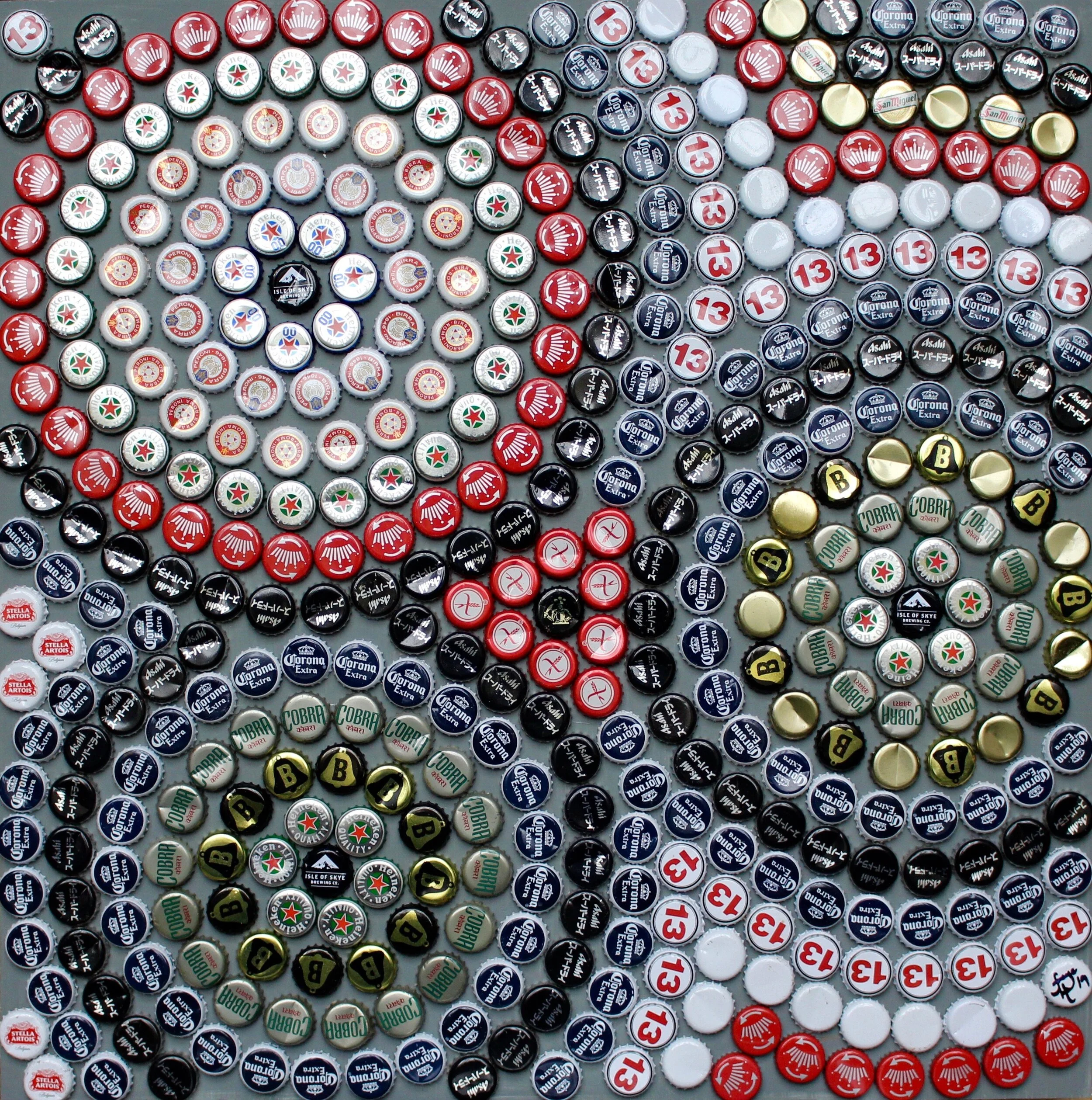
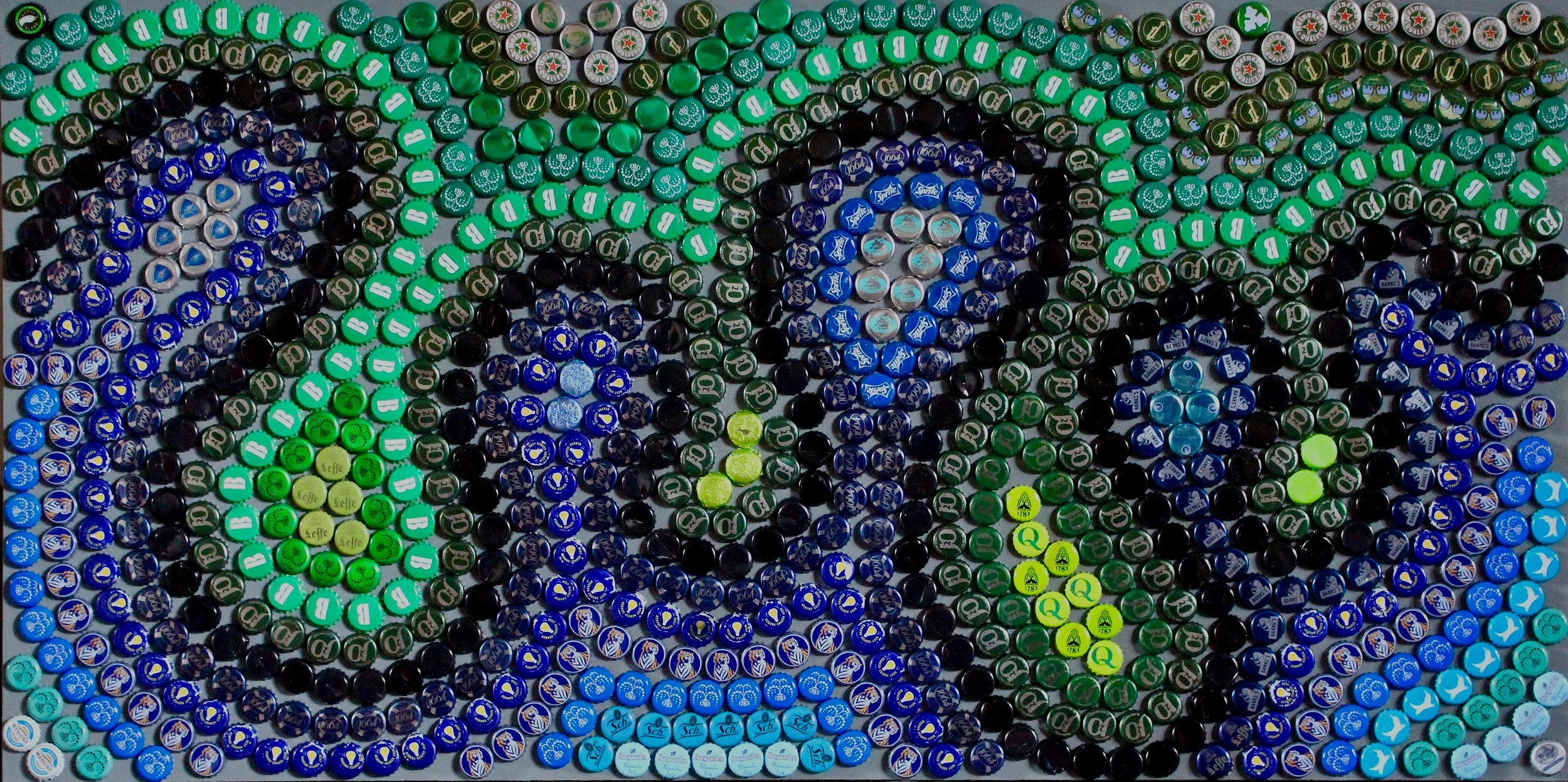
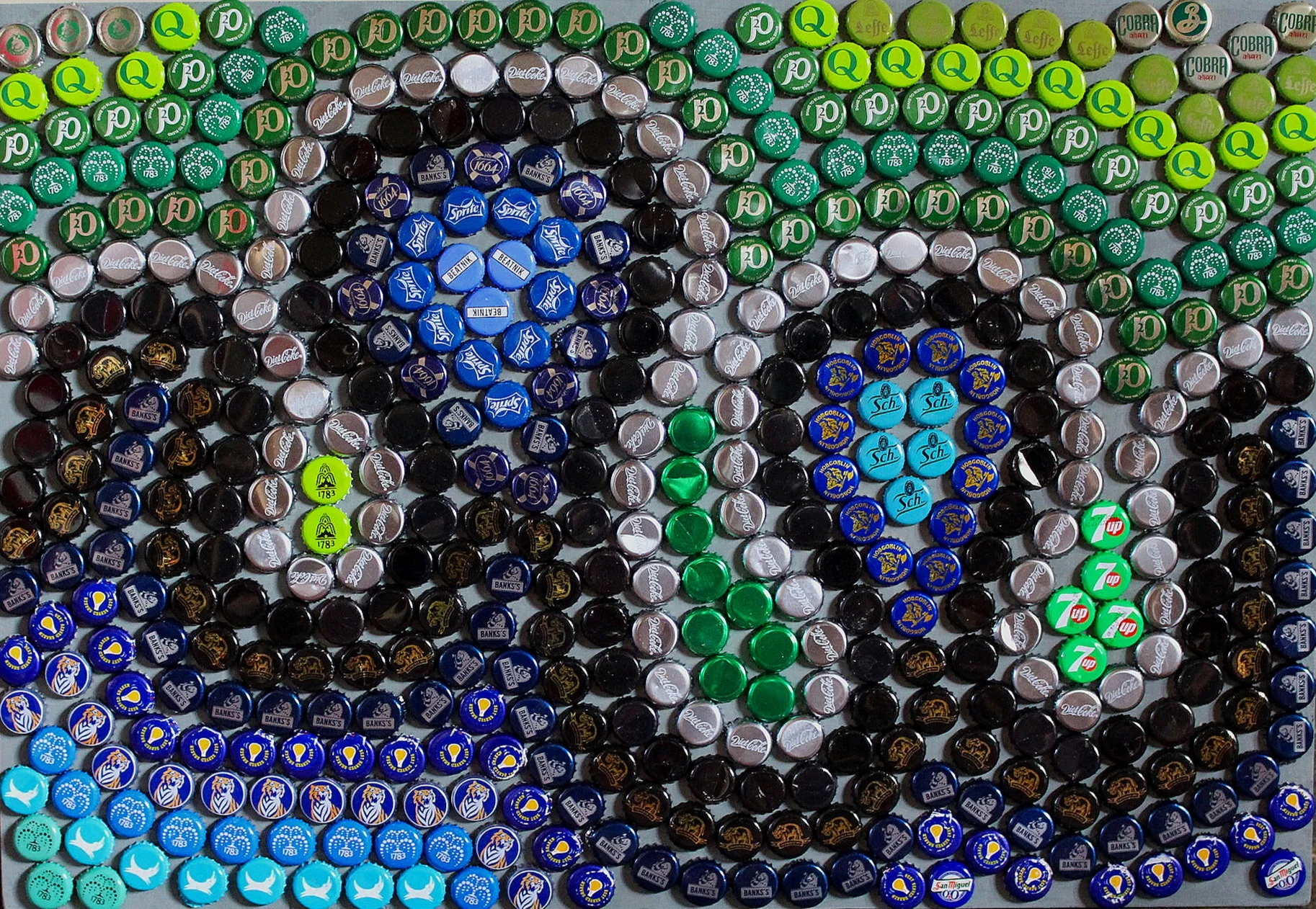
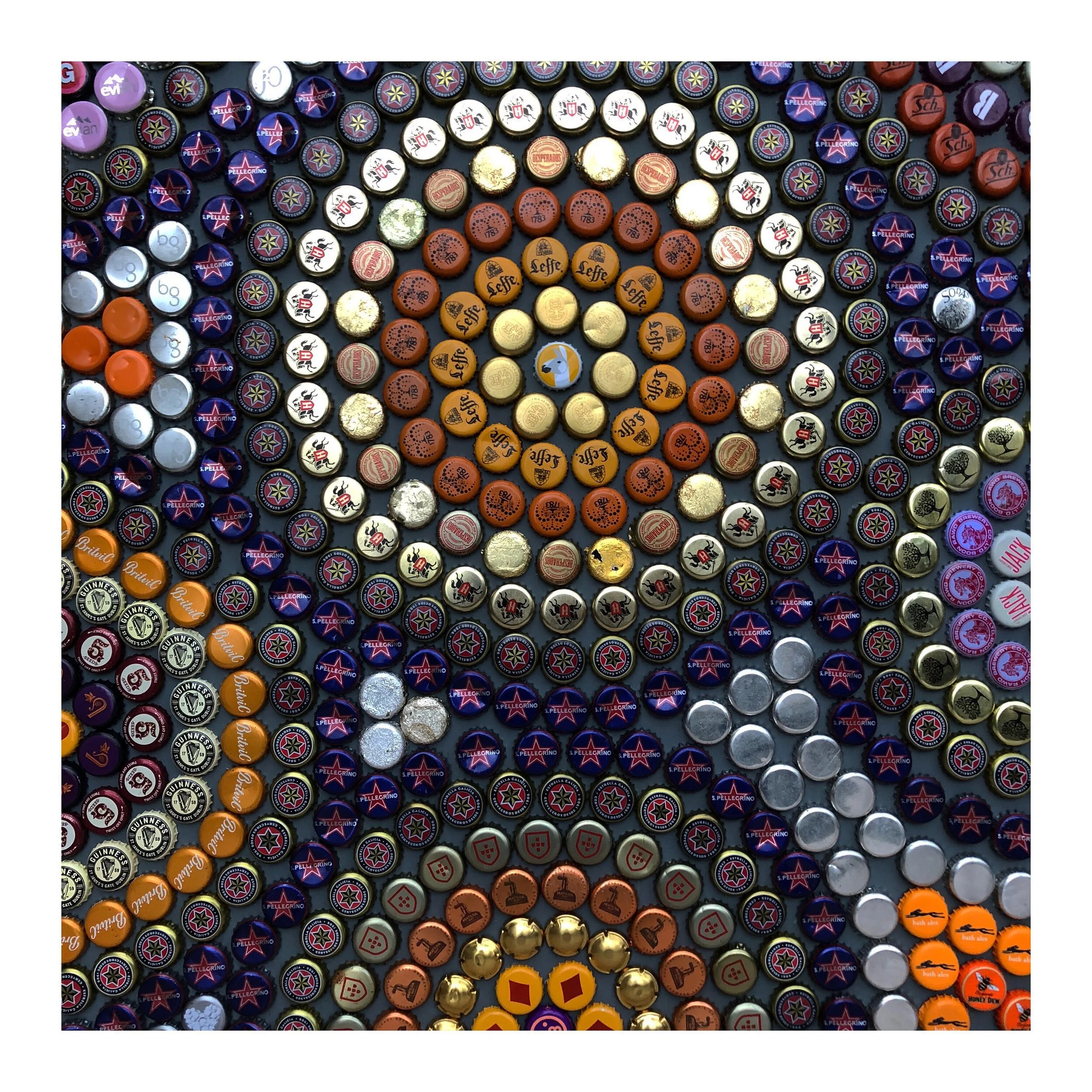
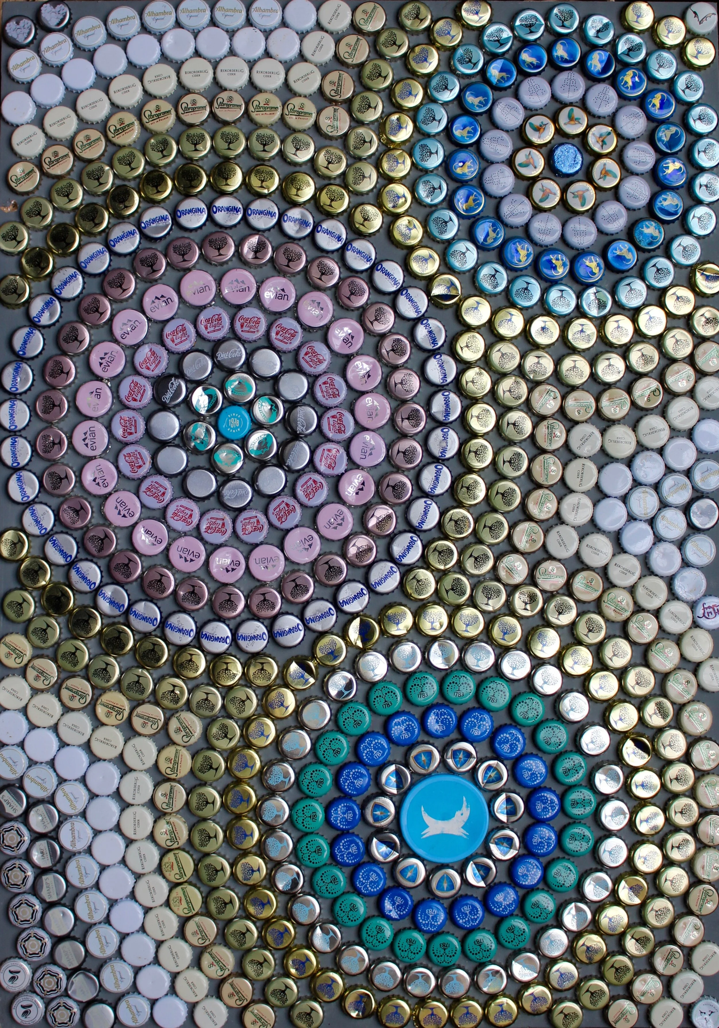
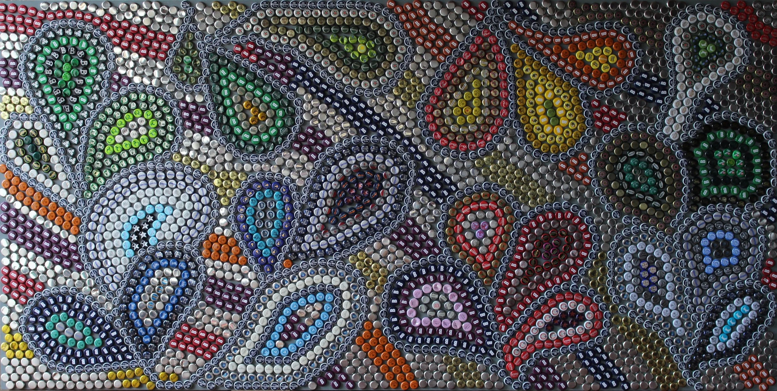
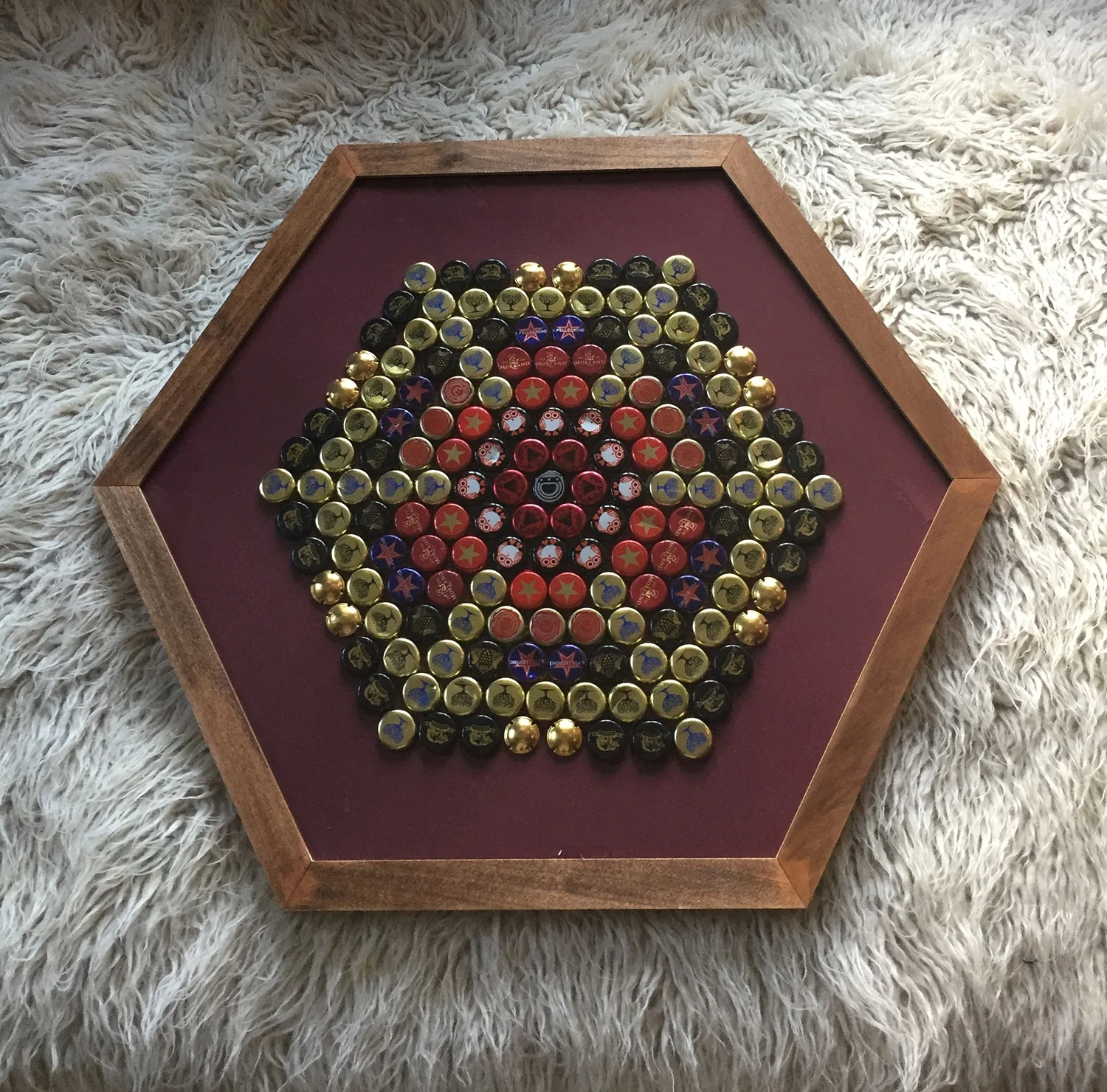
I think the shiny, metallic, colourful, jewel-like qualities of bottle-tops that attracted me as a child are still a core part of what attracts me to them now, but in an artistic sense, I find they offer much else besides.
When arranging these near circular shapes next to each other, a hexagonal grid pattern naturally forms, which removes the need to make 'traditional' decisions about line and form in the art-work. What remains are choices between the huge variety of colours, tones, designs and meanings present on the bottle-tops themselves.
I like to create pieces that have different 'layers' of interest. At a distance, intricate designs on the tops have more of a tonal effect on the top's predominant hue, allowing broad spectrums of colour, tone and reflection to juxtapose within the whole piece. But closer inspection of the individual bottle-tops can reveal the back stories of the origin of certain tops; perhaps particular brands of beer, or tops that are unique to a regional brewery, or a far distant shore, connect someone to a piece.
The photos on this do not do justice to the 3-D quality of the pieces. The relief effect, the shadows and reflections through changing light, the buckling of some tops as they've been removed from bottles, the dynamic negative space between the irregular, crimped edges of the bottle-tops are important aspects of these art-works. I like to experiment with differently coloured base-backgrounds (which the bottle-tops are applied to) that can be glimpsed behind the tops and have a subtle tonal effect on each piece.
Although these pieces may appear to be abstract, there is always a deliberate orientation present. I always like to add a deliberate 'wrong-un' which I challenge everyone to find, in which the orientation of a particular bottletop is in the opposite direction to those in its linear or circular group.
Pricing
I work by charging 11p x cm2 + Framing costs (if you would like this service). Shipping also available.